From Idea to App - Prototyping
Outline (bold items are being addressed in this post):
- Identifying a Problem
- Sketches
- Prototypes
- Sketching Continues
- Clickable Prototype
- Proof of Concept
- The Backend
- Building the App
- Laying Out Screens
- Defining Input
- The Loop
- Social
- Polish
- Done
Prototypes
The quickest way to go from an idea to an app is to create a prototype.
A prototype is a rough approximation of your app idea. Prototypes can be constructed simply using sketches on paper (paper prototype), fully designed in Photoshop, built on an iPhone or other iOS device, built using tools like Balsamiq, and even built in Powerpoint and Keynote.
Each tool provides different features and benefits. Some tools like UXPin provide easy ways for viewers to send feedback. Others tools closely simulate a native experience. Others, like Balsamiq, use a purposely fuzzy deisng motif to avoid focusing on details.
Your app idea probably sounds great to you. However, if it were built and placed in front of a customer it would likely lead to confusion. Prototypes help you flesh out your ideas by forcing you to packaging your thougths, simplify, and enumerate each of the features you wish to provide.
Building an app is expensive. When you factor in lost opportunity costs, developer and designer time, rent, and businesso verhead building an app without a prototype can be extremely expensive. There are several startups trying to help save designer, developer, and business time by simplifying the process for testing out ideas without building anything.
My personal approach to building products tends to gravitate around lots of time sketching, prototyping, and testing. In 2012, I was introduced to Keyotopia. I had never been able to quickly communicate my ideas to others until I used it in my last startup. It is now core part of my workflow.
Sketching Continues
The concept I have for Truffle really needs to be sketched out. Logically laying out screens helps to put stakes up around what the first version of the application will be.
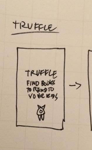
simple launch screen
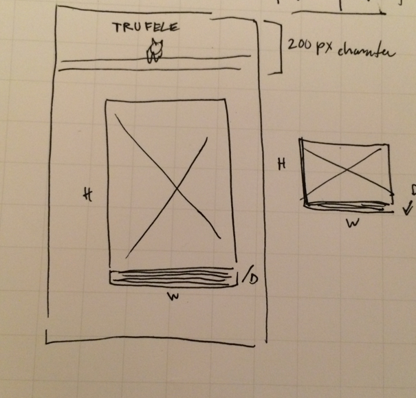
playing with a flexible height/width method for displaying covers
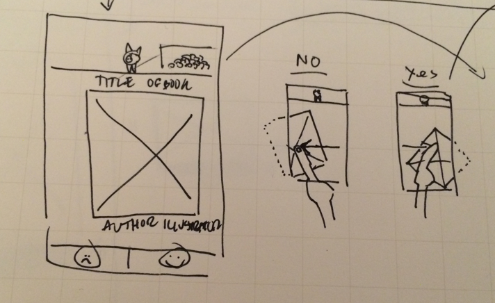
sketching out simple tinder-style gestures
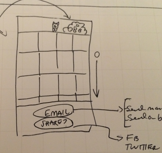
a favorites page with built in email/sharing
I decided to place the pig at top of screen so it will be visible across pages. To its right will be a pile of truffles (one for each favorited book). Need to figure out how to make it not look like poop.

Playing with taglines
I have been playing with taglines for the launch screen.
- Book recommendations for kids.
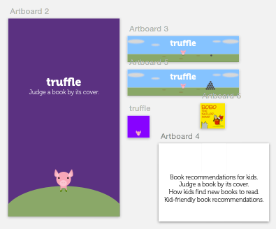
- Judge a book by its cover. -- I like this one the best.
- How kids find new books to read.
- Kid-friendly book recommendations.
The app will have 4 major sections:
- A launch screen
- need to have a strong value proposition
- An Onboarding process
- I'm not sure how to handle this. I might just make the app have a guide, but not user accounts.
- The core rating/swiping section
- I will use a swipable gesture and custom classes for views
- A place to view Favorited books
- I will use a UICollectionView to show the books the user has liked.
Clickable Prototype
I took the sketches and composed a handful of screens. You may need to zoom out.
I designed the character, and top part of page in Sketch.
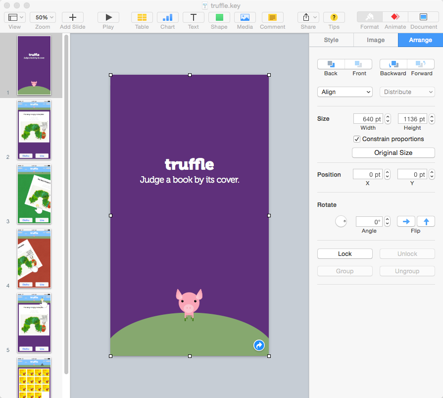
I compose and layout the screens in Keynote. I set slide dimensions to mirror an iPhone 5s (640w x 1136h). I use Keynotopia design library for the iOS 8 controls.
Next: Proof of Concept
This tutorial seems to do exactly what I want. I will be implementing the swipe tutorial in Swift.
